Display Charts and Graphs Analysis on Parent Slips
- Clea Boyd-Eedle (Unlicensed)
- Rizad Akar (Unlicensed)
The Analysis tab will display a chart for each 'closed response' question on the Slip. So select lists, checkboxes which have a closed list of answers will automatically have bar graphs created. There is a Print button that will open a new page with the charts formatted for printing, one chart per page. You could also screenshot a chart if you need to include it in another document in Microsoft Word or Powerpoint as part of a presentation.
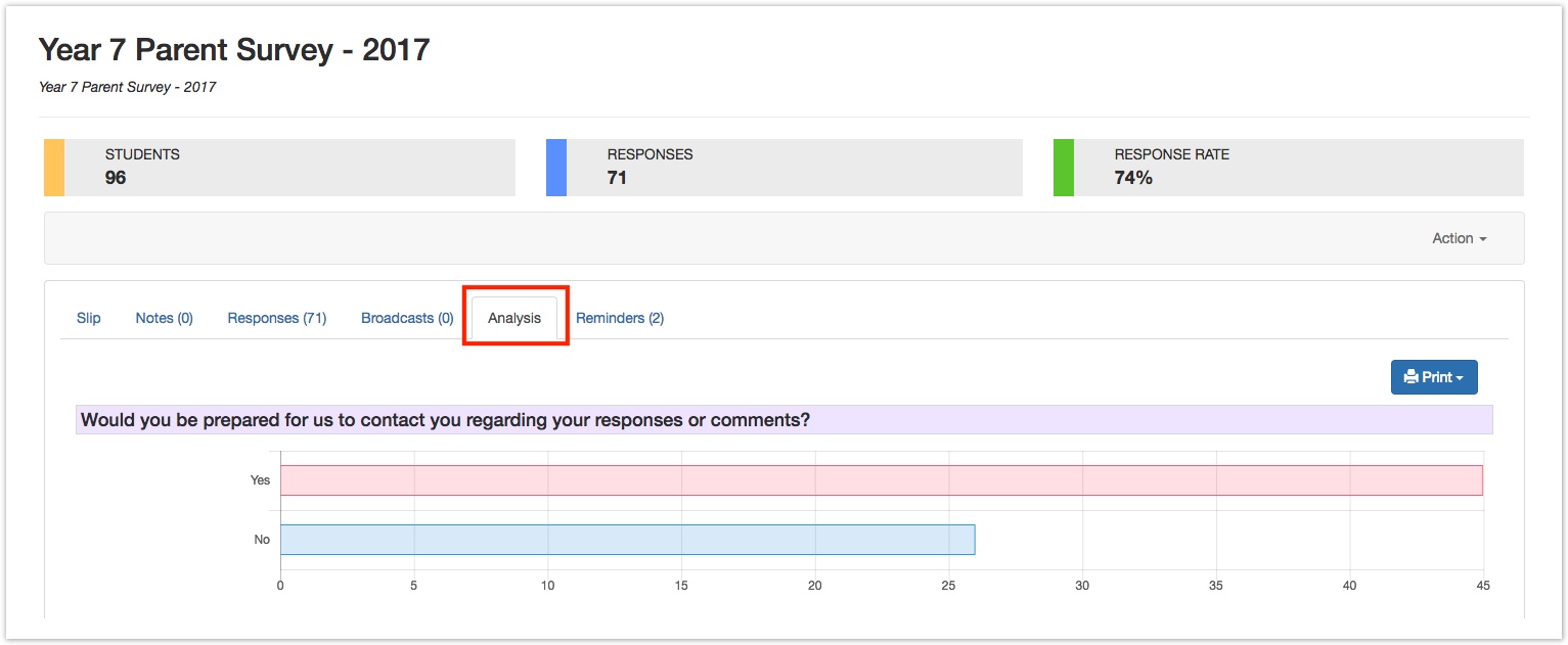
The top chart will always be the 'Contact Response' - the mauve field in the Form Template Designer, the main question that must be on all Slips. The rest of the charts will then display in order below.
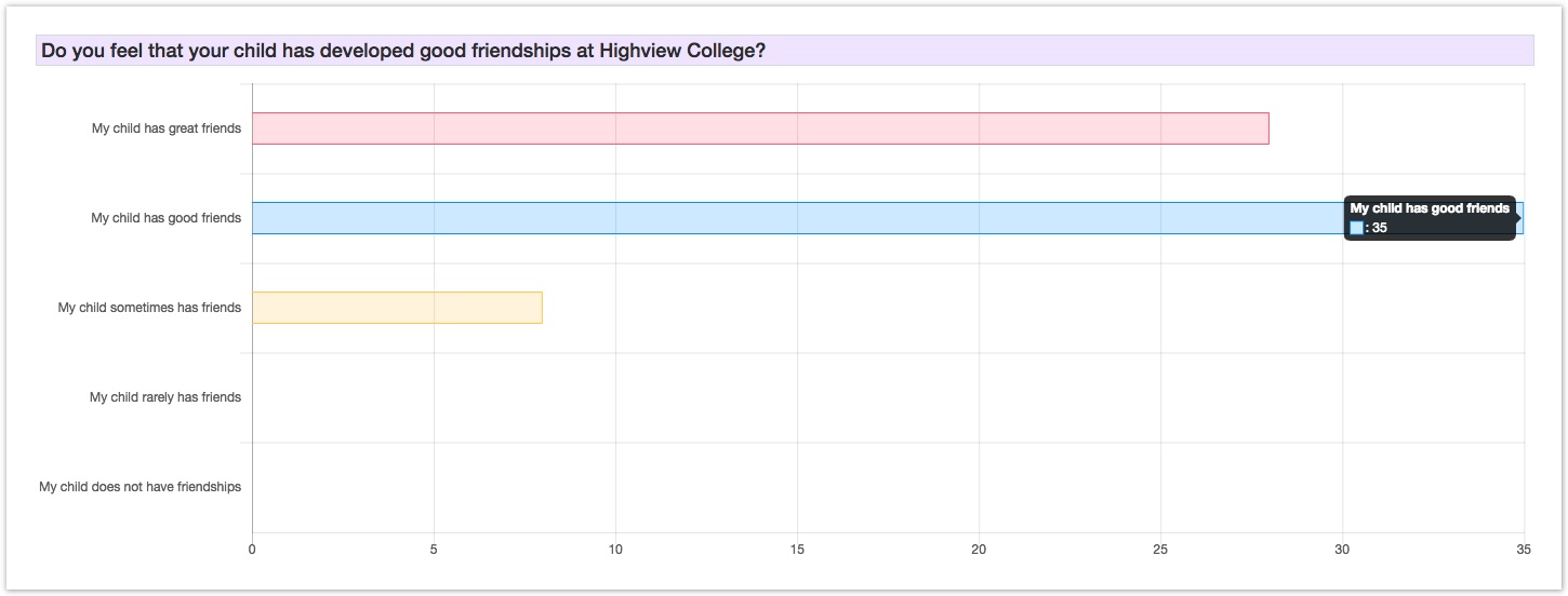
You might be using EdSmart to survey parents, or capture their orders for fundraising products - but we know that most people respond positively to visual representations of data. It's fine giving you Excel exports and lists of numbers and values, but a chart offers a simple and effective way of quickly analysing the results of your parent's online form submissions - whatever the questions you asked.